CASE STUDY
Redefining Wealth Management Through Clarity-First Onboarding & Smart Dashboards

MProfit
MProfit is a non-transactional wealth management and portfolio tracking platform built for investors, Chartered Accountants, and financial advisors, that consolidates investments across multiple brokers and asset classes into a single, unified view. It helps users track portfolio performance, calculate returns, generate capital gains and tax reports, and gain clear insights into their wealth focusing purely on making complex investment data accurate, understandable, and actionable.
Mprofit
Industries
Finance, SAAS, Consumer product
Services we offered
-
Heuristic Evaluation
-
UX Research
-
UX UI Design
Challenges
MProfit was built to solve a serious problem bringing clarity to complex, fragmented investment data, but the experience didn’t reflect that intent. For users, especially investors and advisors encountering the platform for the first time, the product felt dense, procedural, and hard to decode. Essential processes like onboarding, data reconciliation, and portfolio analysis were technically sound but experientially overwhelming. Instead of guiding users toward understanding, the interface demanded effort, patience, and prior knowledge. As a result, users struggled to find early value, confidence in the system took time to build, and much of MProfit’s true capability remained under utilized.

what am I setting up?
Onboarding was process heavy, but offered little context or guidance. Users had no clarity on the impact of each step and their progress, leaving many feeling overwhelmed before reaching the product’s core value.

Everything looks the same!
The dashboard relied heavily on tables and uniform graphs, making it difficult to distinguish between elements. Functionality and views shared the same navigation space, often confusing users.

I’m not sure what to do.
First-time users were presented with many options but little direction. Without clear cues, hierarchy, or moments of delight, exploration felt effortful, leading to drop-offs and limiting platform Value.
Meet the users


Accurate Analyze. Evaluate. Evolve.Reports
In the heuristic analysis of MProfit’s platform, Our team recognized that years of built functionality had shaped strong user habits that couldn’t be disrupted overnight. Although Change was inevitable, It must not be disruptive. So, we planned a phased approach targeting new users and their pain points, then gradually extending to existing ones, so adaptation felt natural and trust in the platform remained intact.
-
Tackling Onboarding
-
Fixing the Dashboard
-
Redefining Reports

Onboarding Designed for Confidence
We transformed a process-heavy onboarding flow into an experience that felt guided and engaging rather than demanding. By introducing progressive data fill, users could not only completed setup, but also understand how to read and access their data once inside the platform. Visual cues clarified what users were creating at each stage, while clear info pills served as a guide at crucial stages. These small but intentional interventions removed uncertainty, eliminated the need for troubleshooting, and ensured users were never left guessing. The result was higher onboarding completion, and a first experience that felt reassuring, rewarding, and confidence-building.

A Dashboard That Reveals, Not Overwhelms
We rethought the dashboard aiming to improve two core aspects - Navigation and Data Visualization. We transformed the journey in a guided format for new users, providing them with a demo experience. Extending the idea of progressive fill beyond onboarding into the core experience. The dashboard was designed to adapt as data gets added, revealing insights in layers and allowing users to drill deeper only when needed. We made good use of graphs and charts wherever information can be simplified to present financial data in a comprehensive manner. This structural and visual change to the dashboard led to more control over data and higher user literacy.


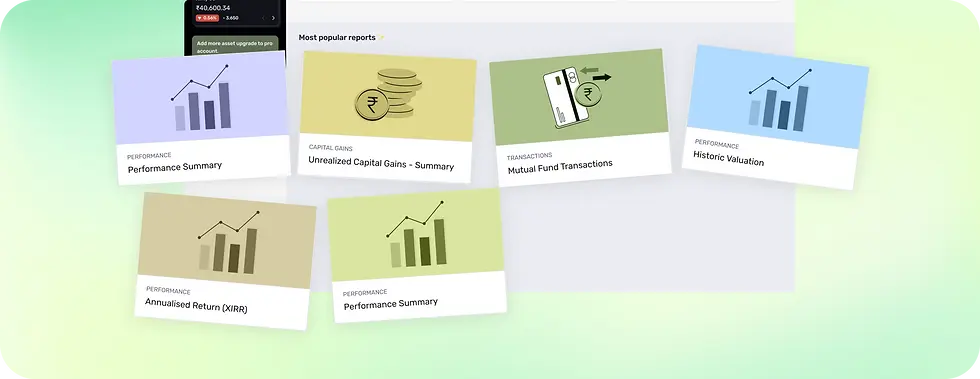
Reports That Work the Way Users Do
We redesigned the reports experience to feel structured, intentional, and easy to return to. This section was tackled by splitting reports into three parts: Saved, Category and Suggestion. Reports were organized into clear folders, supported by search and smart filters that helped users reach what they needed quickly. We introduced smart sections like recently viewed, saved, and recommended reports to align with real user behavior and reduce repetitive effort. Together, these changes turned reports into a focused workspace one that guides users naturally, encourages repeat usage, and supports both quick checks and deeper analysis without friction.


Mobile, Focused on What Matters
We designed mobile as a companion to the web experience, focusing on what matters most on the go. While it doesn’t replicate full web functionality, it enables users to track progress, receive updates, and access key portfolio information quickly. By prioritizing core actions, mobile allows users to stay informed and connected wherever they are.

Impact
-
Higher user retention – Improved onboarding, clearer dashboards, and structured data helped users find value faster and return with confidence.
-
Increased pricing premium – A more refined, intentional UI elevated the perceived quality of the product, supporting stronger pricing.
-
Stronger product credibility – The well-thought-out interface reinforced trust in the platform’s accuracy and depth.